
Details about the Report
Background
The
purpose of the Crawdad Campaign Tracking Dashboard is to give researchers, analysts,
and citizens a real-time, dynamic, non-partisan analysis of the messages coming
from the Bush and Kerry campaigns during the summer and fall of 2004. We
encourage people to use the information presented in the Dashboard for their
own further analysis and interpretation.
Explanation
For the Bush and Kerry sites, we collect and analyze two sources, the news releases (News) and web log (Blog) posts. These represent formal, purposeful communications from the campaigns to the public and media. A new report is produced each morning at 4:00 MST for the week ending the previous day. At this time, the blog analysis only includes the main story posts, not the follow-up comments.
The reports are non-partisan and are generated automatically, using identical procedures for each web site and source to generate the displays. Thus the content of the dashboard is an unbiased source of content analysis. The dashboard values are based on releases and posts for the seven days ending the date of the report.
Analysis is based on Centering Resonance Analysis (CRA), a patent-pending network text analysis technology developed by Crawdad Technologies. CRA performs linguistic analysis on text to identify the words representing the main subjects and objects of discourse. It then links these words into a network that reflects the intent of the writer. It then determines the influence of words by looking at their structural positions in these networks. CRA has been used in a number of different applications involving analysis of qualitative data.
The dashboard uses CRA-based technology to create the following displays:
|
Display |
Range |
Description |
|
Mud Meter |
0 to 100 |
Indicates the extent to which a given source uses negative language with respect to its opponent. We divide each story/posts for the previous week into sentences, and select only those sentences containing the names of the opponents. For these sentences we calculate the proportion of words that are negative (see Tone, below), including the name of the opponent. We then rank the stories according to this value. The meter shows the average of the mud values for the top one-fifth (20%) of the releases/posts in the previous week.
|
|
Focus |
0 to 100 |
This is measures the extent to which the individual releases or posts are organized and focused on particular ideas. The value reported is an average for all releases/posts in the previous week. |
|
Tone |
-100 to 100 |
This measure indicates the extent to which releases or posts use positive versus negative language. This is done by applying a large dictionary of words that are in most contexts positive (victory, solution, etc.) or negative (disaster, problem, etc.) and calculating the influence values of words that match the positive/negative lists. The value zero indicates neutral language, a negative value indicates negative language, and a positive value indicates positive language. The value reported is an average for all releases/posts in the previous week. |
|
Intensity |
0 to 100 |
This measures the extent to which the releases or posts for a given day tend to use positive/negative versus neutral words. Together the tone and intensity indicate how positive or negative the language was, and how much language is dominated by positive or negative words. The value reported is an average for all releases/posts in the previous week.
|
|
Top Words |
n/a |
This reports the ten words that occurred in the most documents, and had the highest average influence in the documents where they appeared. Words with high influence values are especially important at tying together other words in a text to make it coherent. Therefore, the words in these lists can be thought of most responsible for organizing the ideas in the releases or posts in the previous week. Candidate names are excluded from the lists because they are almost always highly influential.
|
|
Output |
n/a |
The number of words and number of stories produced by the source over the last week. |
|
Image Nets |
n/a |
These show how a given website (News and Blog combined) positions, or semantically frames the names of the two candidates. Only about a dozen words can be shown for each net. We select words based on their newness, their strategic value (positive words about candidate and/or negative words about opponent), and their influence in the CRA networks. |
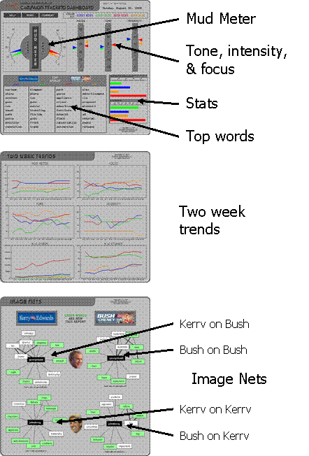
The Dashboard is arranged into three panels: The main panel which presents the Mud Meter, measures of tone, intensity, and focus, number of articles, and top words. The second panel shows two-week trends for those statistics. The third panel shows the Image Nets.
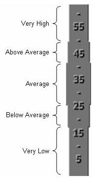 On the first panel, the shape of the displays for
focus, tone and intensity show ranges derived from an analysis of over 32,000
news articles. This allows us to compare the text from the campaigns to
what could be considered “normal” for news articles.
On the first panel, the shape of the displays for
focus, tone and intensity show ranges derived from an analysis of over 32,000
news articles. This allows us to compare the text from the campaigns to
what could be considered “normal” for news articles.
The ranges are indicated graphically by the stepped widths of the scales, as shown in the example at right. The widest, center portion shows the average range (bounds are mean +/- 1 s.d.). The next narrowest segments to the top and bottom show the above average and below average ranges (bounds are mean +/- 2 s.d.). The narrowest segments toward the top and bottom show the very high and very low ranges.
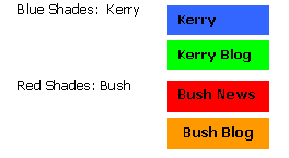
The displays are color-coded as follows:
Example
The following example demonstrates how political messaging shifted during the Democratic convention in July 2004. The first dashboard is from July 27, 2004, the Tuesday of convention week, after former Presidents Carter and Clinton had spoken.
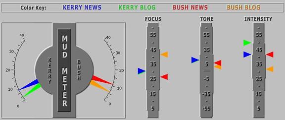
The color code is given in the top frame. Here is what we can observe on the dashboard:
- Kerry and Bush news are a bit muddier than their blogs. They are both at the same, relatively low level.
- Kerry news and blogs, and Bush news, are average in focus, and slightly or moderately high in tone and intensity: positive and enthusiastic. The Bush blog is high in focus, and average in tone and intensity: balanced and focused.
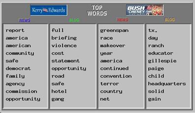
The next panel shows the
most influential words. We see Kerry communicate broad themes (American,
community, safe, family) and specific topics (agency, commission, gang,
violence). Bush also communicates such themes (
The next figure shows two week trends for these data.
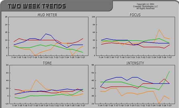
From these graphs we note that:
- Kerry mud decreased prior to the convention, as had been the official party line before the convention.
- The Bush blog became more focused prior to the convention.
- Tone was relatively stable over the two week period.
- The Bush blog became less intense (more neutral) before the convention, while the Kerry blog significantly increased in intensity (more enthusiastic).
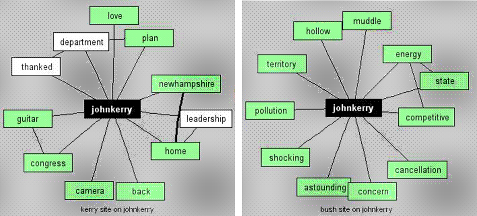
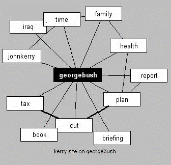 Image Nets show how each web site portrays their own
and the other candidate. One of the Image Nets, concerning how Bush was
portrayed by Kerry, is illustrative. The network represents a “semantic
network”. A connection from a word to the main subject (in this case, the
candidate’s name) indicates that the author made an intentional connection,
semantically, between the two. We can see the two are being directly
compared, and Kerry has also connected Bush to “tax cut”, “
Image Nets show how each web site portrays their own
and the other candidate. One of the Image Nets, concerning how Bush was
portrayed by Kerry, is illustrative. The network represents a “semantic
network”. A connection from a word to the main subject (in this case, the
candidate’s name) indicates that the author made an intentional connection,
semantically, between the two. We can see the two are being directly
compared, and Kerry has also connected Bush to “tax cut”, “
Now, let’s jump ahead to the following Saturday, July 31, two days after the end of the convention.
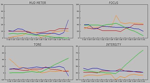
We can see quite different trends in the Kerry news and blog. The Kerry news increased significantly in mud and decreased in tone, while the blog decreased to almost no mud, lost focus, and increased significantly in tone and intensity. Thus we can see quite different roles being played by press releases and speeches versus the web blog. Forwarding to one week after the end of the convention, August 6, framing has become strong; we see in the Image Nets that Kerry is being portrayed very differently by Kerry than by Bush (not surprisingly).
In summary, the Campaign Tracking Dashboard
provided insight into several interesting dynamics even in this relatively
short but important period of time. The convention first caused Kerry
messages to become more positive in tone and more intense; after the convention
Kerry news became much muddier and negative, while Kerry blog
moved in the opposite direction. We also note, quite outside of public
perceptions and media reporting, these particular political communications are
positive in tone and not very muddy.
About Crawdad Technologies
Crawdad Technologies (web site) helps people capture insight from qualitative data, such as mass media, interview transcripts, survey comments, and problem reports. Crawdad specializes in the analysis of dynamic human communication, identifying patterns and relationships that lead to actionable knowledge. Crawdad offers expert analytical services, and the software package Crawdad Text Analysis System 1.1.
Campaign Tracking Dashboard Crawdad Homepage
Copyright © 2004 Crawdad Technologies LLC. All rights reserved.